A website can look modern, polished, and visually impressive and still fail to generate enquiries, sales, bookings, or meaningful engagement.
That is one of the most common problems businesses face with their websites.
- The colours are right.
- The animations are smooth.
- The images are high quality.
- The typography looks premium.
And yet, something isn't working.
Visitors arrive, look around, and leave. The problem is often not the visual design. It is the experience behind the design. A successful website isn't simply one that looks good. It is one that helps the right visitor understand your business, trust it, and take the next step with as little friction as possible.
That's where UI and UX design become important.
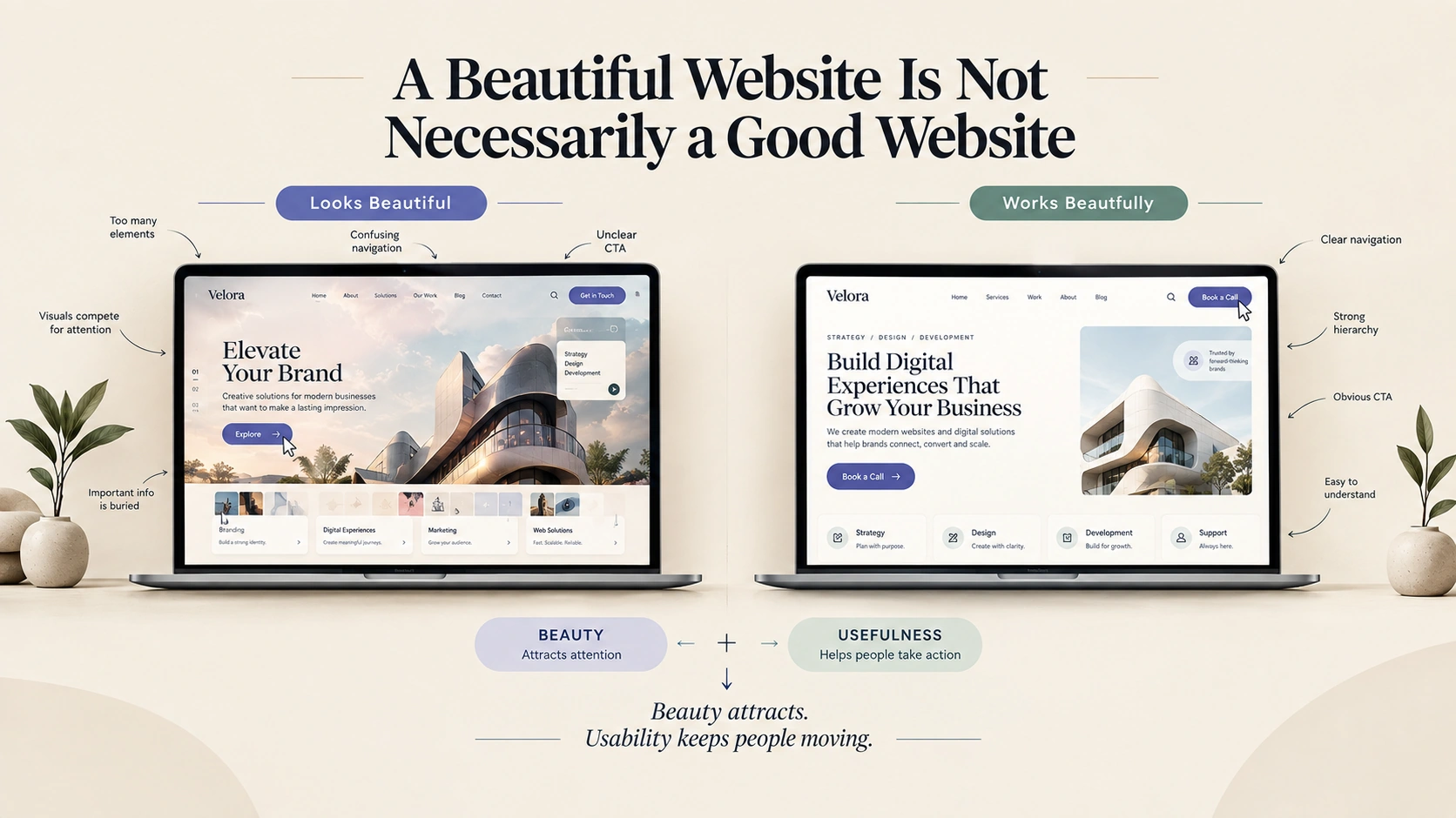
UI Gets Attention. UX Gives It Direction.
UI, or User Interface, is what people see and interact with.
It includes:
- Typography
- Colours
- Buttons
- Images
- Layouts
- Icons
- Forms
- Animations
- Navigation elements
UX, or User Experience, is about what happens when someone uses the website.
- Can they find what they're looking for?
- Can they understand the information?
- Can they complete an action easily?
- Does the journey feel natural?
- Does the website answer their questions before they have to ask them?
You can have excellent UI and poor UX and when that happens, the website may look impressive while delivering a frustrating experience. The best websites bring both together.
Your Homepage Has a Job to Do
Your homepage isn't simply the first page people see. For many businesses, it is the first conversation a potential customer has with the brand.
Within a few seconds, visitors should be able to understand three things:
What do you offer?
Who is it for?
What should I do next?
This doesn't mean your homepage needs to explain everything immediately. It means the hierarchy needs to be clear. A strong homepage usually guides visitors through a logical sequence:
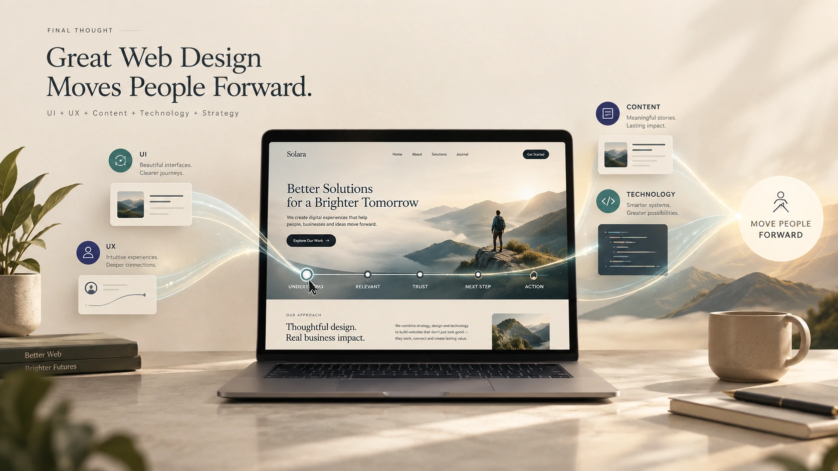
Attention → Understanding → Trust → Exploration → Action
The design should support this journey. If everything on the page is competing for attention, nothing feels important. That is where visual hierarchy becomes critical.
Design should support business goals
The Problem With “Too Much Design”
More design doesn't automatically mean better design.
A website can become overloaded with:
- Excessive animations
- Too many colours
- Complicated navigation
- Large blocks of text
- Multiple competing CTAs
- Unnecessary pop-ups
- Decorative elements
- Slow-loading videos
- Overly complex interactions
Each element may look good individually. Together, they can make the website difficult to use. Modern web design isn't about adding more. It is about knowing what deserves attention and what doesn't. Sometimes the most sophisticated design decision is removing something.
White Space Is Not Empty Space
White space or negative space is often misunderstood as wasted space.
It isn't.
It gives content room to breathe. Compare two designs. One has tightly packed text, buttons, images, icons, and sections. The other gives each element enough space to establish its own importance. The second design will usually feel easier to understand.
White space helps establish:
- Hierarchy
- Focus
- Readability
- Rhythm
- Visual balance
Premium websites often feel spacious not because they contain less information, but because they present information more intentionally.
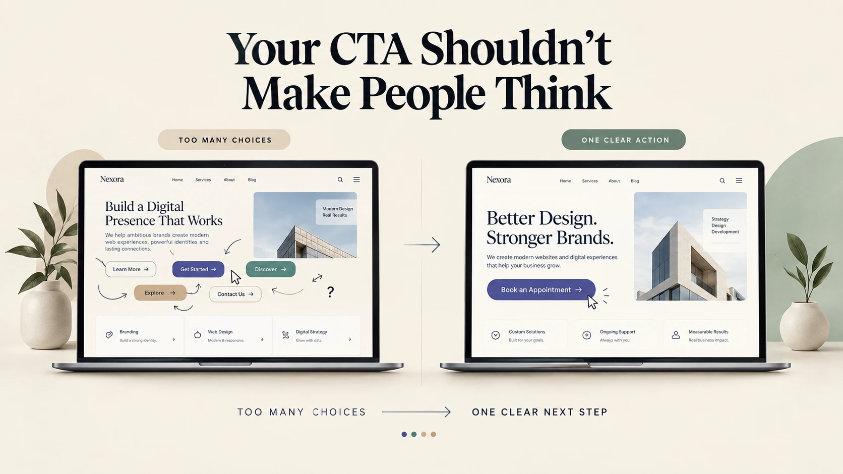
Your CTA shouldn't make people think
Mobile Changes the Experience
A website isn't finished when it looks good on a desktop screen.
Today, users may encounter your website on:
- Smartphones
- Tablets
- Laptops
- Desktop monitors
- Large displays
The experience needs to adapt. But responsive design isn't simply about shrinking a desktop layout. Mobile changes how people interact with a website. Buttons need to be easy to tap. Navigation needs to be simplified. Content hierarchy becomes even more important. Images need to load efficiently. Forms need to be easier to complete. A design that works perfectly with a mouse and large screen may not work equally well with a thumb and a small screen.
That's why mobile-first thinking matters.
Speed Is Part of UX
Performance is also part of design. A visually impressive website that takes too long to load creates a poor user experience before the visitor even sees the design. Large images, unnecessary scripts, heavy animations, inefficient code, and third-party integrations can all affect performance.
This creates an important design principle:
- Don't design an experience that the technology cannot deliver efficiently.
- Good web design considers performance from the beginning.
- Image optimisation, responsive assets, efficient animations, clean code, and sensible interactions can help create a website that feels both beautiful and fast.
Trust is a design element too
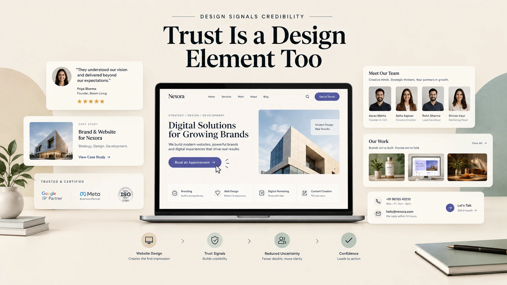
Good UX Reduces Questions
Think about the questions a potential customer has before making a decision.
Depending on the business, they might ask:
- What exactly do you offer?
- How much does it cost?
- Who is this for?
- Where are you located?
- How does the process work?
- Can I trust you?
- What happens after I enquire?
A good website anticipates these questions. This is one of the biggest differences between a website that simply presents information and one that actually supports a business. UX is partly about answering questions before they become obstacles.
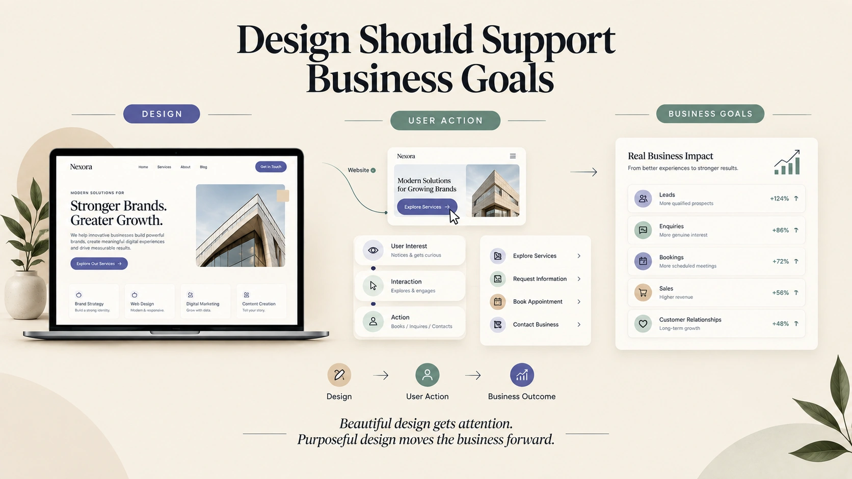
Design Should Support Business Goals
A website should have a purpose. For one business, that might be generating enquiries. For another, it could be selling products. For a professional service, it might be booking consultations. For a B2B company, it could be generating qualified leads. For a portfolio, it might be demonstrating expertise.
The design should reflect that objective. If the primary goal is lead generation, the journey toward an enquiry should be obvious. If the goal is e-commerce, product discovery and checkout should be effortless. If the goal is building credibility, content, case studies, and social proof should play a larger role. There is no universal website layout.
The right design depends on the business, audience, and objective.
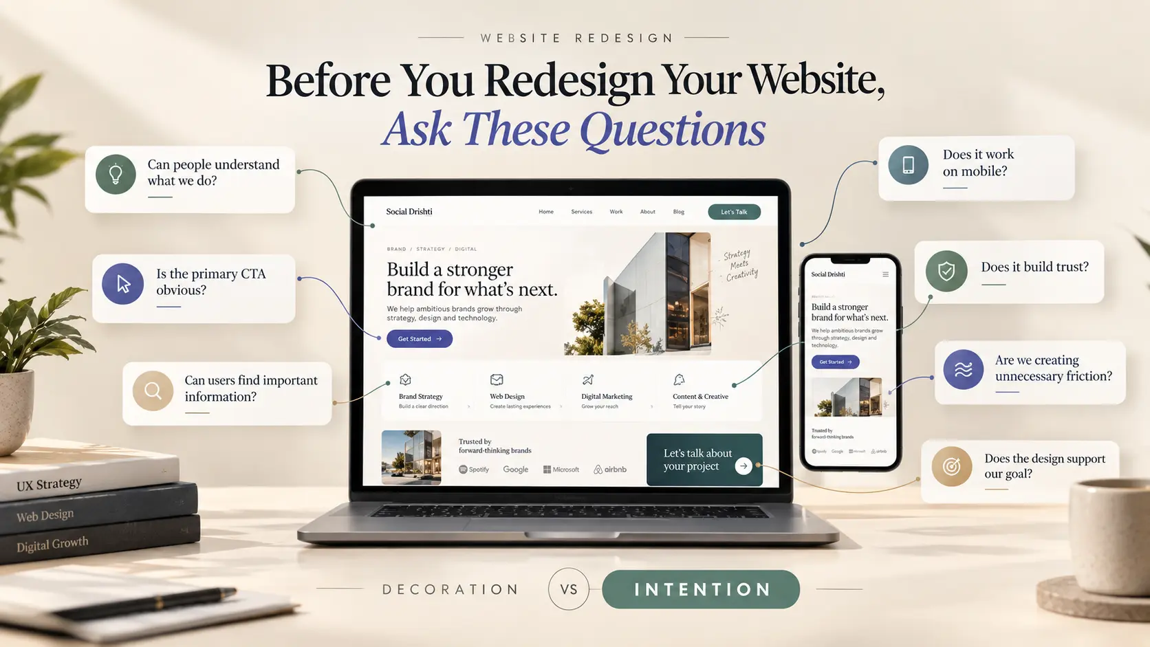
The Best Website Design Often Feels Simple
When a website works well, users don't necessarily notice every design decision.
They simply move through it. They understand the message. They find what they need. They trust the business. They know what to do next. That's the real value of good UX. It doesn't necessarily draw attention to itself. It makes the entire experience feel easier. And that is why a website shouldn't be judged only by how it looks in a design presentation. It should be judged by what happens after someone starts using it.
Final Thought


Comments